Finding vs Retaining
It can cost a business anywhere from 5 to 25 times the amount to get a new customer as opposed to retaining an existing customer. Customer consistency can be a strong indicator of having identified your target audience or a value proposition that is solidifying your position in the market. Similarly companies are interested in retaining employees as it can cost thousands of dollars per the sunk cost of the onboarding process.
Likewise, NBA teams (really any professional athletic team) spend thousands in scouting prospective talent, hiring family and friends as employees in an effort to gain goodwill, travel expenses when participating in team functions or games, etc. It can be detrimental to a franchise to draft a highly proclaimed player and then turn around and part ways by the end of their rookie contract.
Cohort Analysis for Measuring Consistency
“If everyone is moving forward together then success takes care of itself”
Henry Ford
Team chemistry in the business or sport setting isn’t always critical to success but can be a significant help. There’s something to be said about the consistency in the 2010s with the Golden State Warriors having Steph Curry, Klay Thompson, Draymond Green, Andre Iguodala, and Steve Kerr. The same a decade before with the San Antonio Spurs having Tim Duncan, Manu Ginobili, Tony Parker, Bruce Bowen, and Greg Popovich.
Spending time together helps groups understand personalities, behaviors, and communication preferences. When social norms are put in place there is a natural flow that follows by not needing to establish rules for meetings or other interactions.
Cohort analysis is a technique used to tie a metric of retention to a specified group. A software company releasing new features on a monthly basis can use cohort analysis to understand how customers churn. A university wanting to know how well they are graduating students (versus dropping out) could use cohort analysis. The NBA as an organization might be interested in knowing how long players are staying in the league and that is where the rest of this post will focus.
All thanks to Greg Reda for being the first (that I found) to post a comprehensive Python workflow back when I was trying to learn Python for data analysis. His original post that I patterned my own code around is here. There is a post I have subsequently found by a likewise intelligent guy named Eryk Lewinson that is here. I haven’t done an extensive side-by-side comparison of the two scripts to determine how similar they truly are. I’ve noticed that both use the Seaborn Heatmap as the visualization package of choice, but I do like that Eryk’s includes a measure of how large the initial cohort size is. I’ll be sure to include that in my own python notebook in the future.
Breaking Down this Methodology
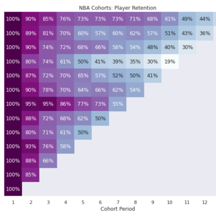
This can seem a little daunting to process but we’re going to really break down how to read this graph. The left vertical border (y-axis or moving top to bottom) shows the year (or time period of your choice) in which a new cohort is established. The bottom horizontal border (x-axis or moving left to right) shows how that initial group (regardless of starting headcount) decreases over time. The time periods represented by both the y-axis and the x-axis are typically the same. So this could be yearly, quarterly, monthly, etc. At least I have never seen this chart where the time periods are different.
In this instance the top row is the rookie class that involved LeBron James, Dwayne Wade, and Carmelo Anthony. The first column represents their first year in the league. The second column signifies the second year (2004) and the value inside the box shows how many of the players from that specific cohort (in the form of a percentage) were still in the league.
The second row represents the 2004 draft class composed of players like Dwight Howard, Ben Gordon, and Shaun Livingston. However, the second column represents 2005 instead of 2004 being this group’s second time frame.
As you move towards the right following a specific cohort group, players will get injured or won’t be contractually renewed. Starting in the top left corner and moving to the top right corner we see that out of all the players drafted in 2003, by the time 13 years had passed 37% were still in the league.
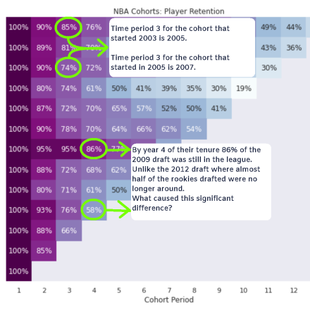
By year 4 of their NBA careers 86% of the 2009 draft was still in the league unlike the 2012 draft where almost half of the rookies drafted were no longer around. What caused this significant difference? Were there rules introduced in 2012 that made it harder for players to remain in the league over time? If you look at the values for all draft classes for the 4th time period of all cohorts it appears as though the average value is anywhere from 70-60 percent. 58% isn’t too far below that norm. It just seems as though 86% by the 2009 draft class was significantly high and maybe we can identify what either prepared this incoming class to perform at a higher level or was there something favorable about the league itself from 2009 – 2012 that made it easier for this draft class to persist.
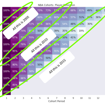
You might be inclined to want to understand how time periods align. In this example I’ve marked how you can read this chart for a given calendar year. However, performance based on a given time period isn’t really the point of this chart. We care about the groups themselves otherwise we would utilize more of a bar chart layout.
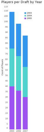
This shows us the total number of players in the league by year with draft class designated by color. It is apparent that the count of players decreases by year, but knowing which group is shrinking the most or if it is consistent across all groups can be difficult to assess without additional labels.
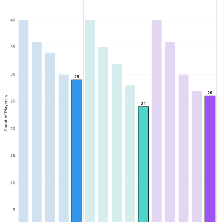
Bar Charts grouped by Draft class can serve as a substitute if we are dealing with a very limited number of groups or time periods. This could be a useful visualization to utilize after an initial review of our starting cohort chart. However, it would be easy to forget these below highlighted bars are NOT the same calendar year but the same Nth year after joining the league.
What's Next?
Bar Charts grouped by Draft class can serve as a substitute if we are dealing with a very limited number of groups or time periods. This could be a useful visualization to utilize after an initial review of our starting cohort chart. Now that we understand how to read a cohort chart and we have identified some favorable groups, what do we do? Various analytical techniques can be implemented to help point to actionable insights.
The first and simpler tool would be segmentation. 77% of the 2009 draft class lasted beyond the typical 4-year rookie contract. What if we further drilled down by conference? Were players significantly more successful coming from the ACC vs the Pac-12? Did more of these players shoot a higher 3-point field goal percentage? Or were they really just taller and possess an amazing vertical jump as opposed to other draft classes.
A second option could be logistic regression. Using a robust dataset derived from this cohort (I would combine the 2003 cohort as well into that dataset) for training a machine learning model, we would then plug individual prospects into the model and get a score indicating the probability of that player lasting in the NBA.
There are others but the focus of this was to help you better grasp the use-case of the cohort chart and how to read it. Please feel free to drop me a comment if I have errored, overlooked, or could further explain something.