
Building my own website has been on my New Year’s Resolution list for a decade. The reasons behind why this was important to me are more clearly explained in the “About” page. The conflict I felt that contributed to the delay is as follows:
Choosing a color scheme
There is a degree of insecurity regarding my ability to create anything that would provide any entertainment or value; but also there has been the psychological barrier of being too picky with trivial things like styling of colors, fonts, and imaging. I just had to embrace that it’s better to get something made and that I can iterate and change as I went along. Plus, color preferences are completely subjective. Individuals prefer certain colors over others for a variety of reasons. There are a number of color combinations adopted by professional sports teams that have a special place in their respective fan’s hearts, yet would be considered highly questionable by those that aren’t enthusiasts of that organization.
Finding Inspiration
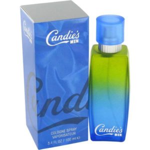
For this first version of the website I wanted to lead with cooler hues, primarily consisting of blue, green, and violet, but were vibrant and bright. Utilizing the psycholody of color theory I was more interested in conveying calm and stability rather than overwhelm with passion and power projected by warm colors. I also wanted to throw back to things from my youth. Being a child of the 80’s I leaned toward something that could be featured in a retro wave design. I also had a pubescent run with Candie’s for Men cologne.
Canva Color Wheel
If you have a particular photo or image you are wanting to incorporate or draw inspiration from, I would recommend something like coolers.co to upload an image you have and it will provide the HEX or RGB codes. Canva’s color wheel was what I chose to went with and experimented until something just clicked into place.
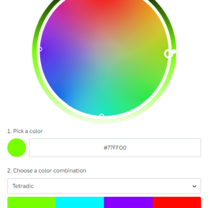
I took a design class in 2021 that stressed building upon your range of colors to pick from. Not sure how much I’m actually going to pull from this but I’ve built upon the initial colors based on consistent adjustments of saturation and brightness.
Creating a Logo
Although I’m initially going for speed of delivery to learn and tweak, it seemed like a modification to the letter K was too straightforward a choice. A filtered headshot of some sort also seemed unchallenging. I wanted to go with something close to my heart, family. I pulled from the primary symbol of the Farnsworth family crest, a duck.
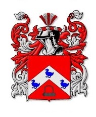
A duck is also significant to me personally for another reason. I became engaged to my wife at the Peabody Hotel in Memphis Tennessee which is infamous for having ducks that live at the building and spend their day in the main lobby fountain. The symbolic meaning of ducks throughout the various cultures is varied. Some of my favorite themes found across cultures are balance, adaptation, and family.
One of my mentors once said to live like a duck, keep your head steady but always kicking to move forward in life.
I wanted to take this animal and incorporate a digital feel to it given my data-centric career and having grown up largely with an 8-bit Nintendo gaming system.
PixilArt.com
First step involved adding my new custom colors to the default palette. I applied a gradient background consisting of my chartreuse web and aqua knowing this would be the filler to the black outline. Filled in the beak with the electric violet.
ProfilePictureMaker.com
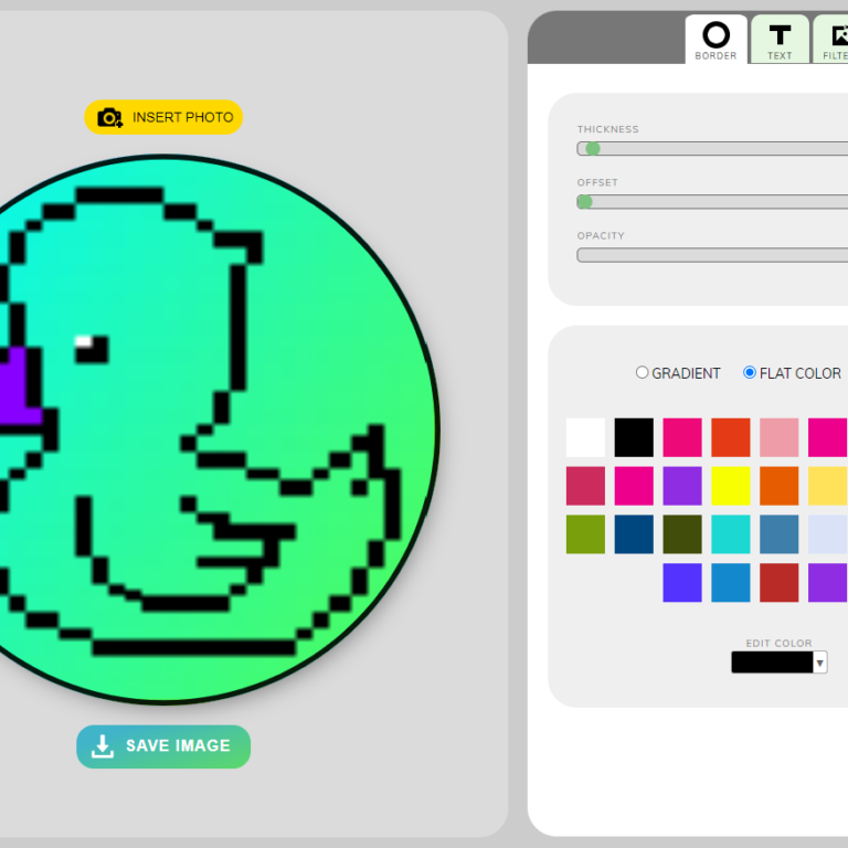
After downloading the file I went to profilepicturemaker.com to put it in a rounded format with a narrow black border. As you can see in the UI for ProfilePictureMaker.com you can pick a solid color or a gradient and adjust the degree of opacity. Something to be mindful of is the ability to thicken the border and add text to it. Which can be useful for including a brand name or campaign/slogan.
Ideas for your own logo/colors
When it comes to building out your own logo or color scheme I will provide a list of ideas to use by itself or combine a couple of these ideas into one.
- Family crests or symbols derived from surnames (E.g. Garcia meaning “Bear” or Gonzalez meaning “Noble Warrior”)
- Religious or mythological symbols that are especially meaningful (E.g. Yggdrasil, Adinkra symbols, etc.)
- Things pertinent to the place of your upbringing or pivotal moments of your life.
Don't forget accessibility!
First and foremost accessibility is not just about the color combinations you select and ensuring they are distinctive from one another. Much smarter and detailed thoughts about this topic as a whole can be found here.
Now having said that it is important to be mindful to the fact there are various forms of colorblindness in the world and not just the most common red-green instance. I took the following image from Wikipedia.

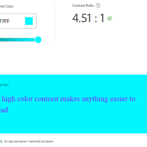
So be sure that the theme you pick passes the accessibility test. Go to color.adobe.com/create/color-contrast-analyzer to see how well your colors contrast for readability.
A few tools for logos
- wix.com/logo/maker/
- logodesign.net
- designevo.com
Getting started with colors
- coolers.co
- colorhunt.co
- color.adobe.com/create/color-wheel
Update 9/18/22 to Version 1.1
Some would say you can’t really have an update to something if it hasn’t been released to the public yet but as I’ve been writing and experimenting I’ve already found some things to be a little more problematic then I’m wanting to deal with.
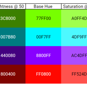
For example as much as it hurts my University of Utah allegiance I can’t keep the #FF0800 red as suggested by Canva. It just clashes too much with everything else for my liking. Plus I want a few more colors to be able to choose from. So we keeping 3 of the original selections but thanks to Coolors.co I’ve been able to come up with the following. How soon make some of these changes has yet to be determined but hopefully we make it at least a few months before blowing this color combination up.

Conclusion
Thanks to my wife and mom for bearing with me through this entire post since nobody else will probably make it this long through my first post. If there is a mystery third or fourth person still reading I hope some of the tools referenced provide some usefulness to you. I’m excited to see how the colors change as I learn more about design and test things out here. The duck will potentially receive some cosmetic treatment over time. However, I wouldn’t plan on it going away any time soon.